Visual skeuomorphism
Intuitively, people can feel their brains being good at understanding things like rooms and tables, and they can feel them being bad at understanding software, apps, and websites. Designers sometimes take this to mean that the visual language of digital experiences is unclear and choose to style things to look like the real world.
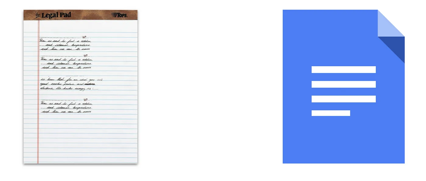
Skeuomorphism, or using decorative design cues in a derivative object that were functional in its predecessor, continues to go in an out of fashion. While fashion shifts, When applied well, a bit of skeuomorphism can make individual affordances clear, but makes an overall experience much harder to use when the metaphor is taken too far. Making a toggle look like a toggle can help users understand they can click it, but a music app that looks like a radio is baffling to nearly everyone.
See: Architectural skeuomorphism
References
Skeuomorphism was never gone. Here’s why. (2020, June 29). The Designer’s Toolbox. https://web.archive.org/web/20201127062222/https://www.thedesignerstoolbox.com/blog/skeuomorphism-was-never-gone-heres-why/
Spiliotopoulos, K., Rigou, M., & Sirmakessis, S. (2018). A Comparative Study of Skeuomorphic and Flat Design from a UX Perspective. Multimodal Technologies and Interaction, 2(2), Article 2. https://doi.org/10.3390/mti2020031
Notes mentioning this note
There are no notes linking to this note.